
Help your website visitors take the actions you both want.
Your key messages to customers need to be strategically placed throughout your website but that alone isn’t enough to generate a return from your website investment. It’s vital that you create clear and simple highlight messages suggesting the actions your website visitors can take to help themselves – Calls to Action. If your website lacks Calls to Action (CTAs), you’ve probably lost a significant amount of potential business volume, and you can’t fault your web visitors for failing to understand your superior value messages. You need to take the responsibility to lead them.
Most people visiting your website are not full of initiative, eager to take immediate next steps after learning about your business. You need to be the natural born leader when you design your website and know how to lead your visitors to “do the right thing.”
People behave a lot like cats when they’re online. They like to do their own thing, especially when browsing or shopping. People abandon shopping carts, neglect to sign up for your informative newsletter and they only skim your important blog for headlines or bullet points while ignoring your brilliant nuanced articles. They purposely avoid clicking that big obvious button unless they are convinced that doing so will reward them. These are just a few reasons why your website performance will fail if you fail to include CTAs where needed. Let’s take a look at what you can do to improve your website response rates, conversions and purchases.
CTAs can be in a passive form such as having your phone number prominently visible. Your “Contact Us” page is a passive call to action. It’s there for any time someone feels like contacting you. “Help” and “Support” tabs passively call your visitors to action when they need assistance.
Alternatively, CTAs can proactively prompt a specific act at a specific stage of a relationship. For example, do you want your visitor to learn more about a service, subscribe to a newsletter, download a white paper or go to your store and make a purchase?
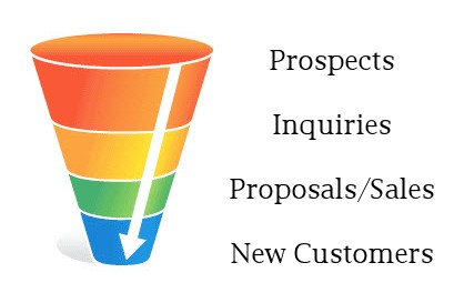
The traditional “sales funnel” is an effective approach to creating an urgency hierarchy in your Calls to Action. Illustrated below is a simple, generic sales funnel. Beginning at the top of the funnel, you gradually lead your visitor to convert to higher interest levels and ultimately a purchase at the end of the funnel. Much is written about how to create sales funnels. Our focus here, however, is to determine what you need to do to incorporate the right CTAs into your particular website.
There are numerous types of Call to Action buttons, each with a different purpose or stage of a buying cycle (point in the sales funnel). We’ll cover the most common in hierarchical order. They are:
- Learn more – Takes visitor to a resource or landing page with deeper information and sometimes a further call to action.
- Sign up – Brings visitor to a web form, often to subscribe to a mailing list or register for a service.
- Download – In exchange for some basic information (always an email address) a visitor can download a file directly from your website. Here you have created a lead for your CRM database.
- Get Started Now – A direct link to a new client or consumer engagement area for visitors who intend to do business.
- Free or Trial Offer – Registers visitor as a “customer” or “account,” usually with a log-in expiration or a credit card charge if no further action is taken.
- Buy/add to shopping cart – The ultimate action taken by your website visitors (as long as they hit the “Approve Payment” button) to complete the transaction.
Where in the sales funnel; at what point of decision are your visitors as they interact with your website and convert to sales leads or new customers? This will determine at what stage you would use each of the above CTAs.
For effective Call to Action design, first determine the specific action you want your visitors to take and then make it compelling for them.
Use compelling word choice – Write powerful, bold and simple instructions. Your exact words will have a big impact on conversion rates. Make the wording as simple and straightforward as possible and follow these guidelines:
- Use simple, direct language with as few words as possible.
- Use a large, bold font for the key words.
- Make your words clearly call for a specific action.
You want your visitors to think as little as possible about their decision to take an action.
Create and build urgency – A sense of urgency will displace second thoughts and minimize distractions. Remember this little gem: “The more opportunities you give them to stop and consider what they’re doing, the more opportunities you’re giving them to say “no” (Hongkiat.com). Give your visitors an authentic and compelling reason to act now! Prices do indeed go up, supplies can indeed be limited, trial offers do indeed expire and sometimes you really do want to build your portfolio of business and are willing to offer limited privileges to new customers. Now is truly the best time to act! Make those messages crystal clear!
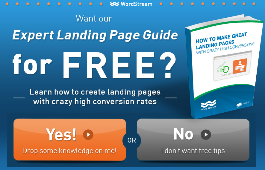
Icons and images work better than text alone – Your conversion links need to be crisp, attractive graphic symbols or icons that draw the eye and communicate a desired step. Dimensional colored buttons just ask to be pushed. Bright shiny icons demand a mouse-over and click. A good Call to Action button or icon communicates its own request to be clicked.
Repeat and Remind – Appropriately repeated Calls to Action in strategic locations of your landing pages increase conversion rates.
Notice in the examples below how simple, succinct and specific the Call to Action messages are.
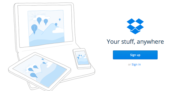
Notice the minimalist simplicity of Dropbox. It works for them.
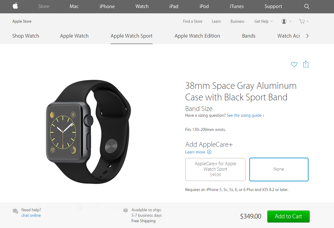
The Apple Watch provides an elegant and enticing (profitable) insurance upsell easily skipped at the consumer’s choice. Notice how the product and the Add to Cart button draw the most visual attention.
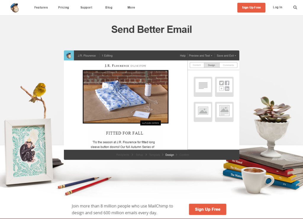
Mailchimp’s homepage is a superb example of UX and CTA best practices. What 3 crystal clear messages do you get? 1) Send better email, 2) Sign up free, 3) if you’re not ready now, browse our site and we’ll guide you at your pace to make your best decision (Features | Pricing | Support).
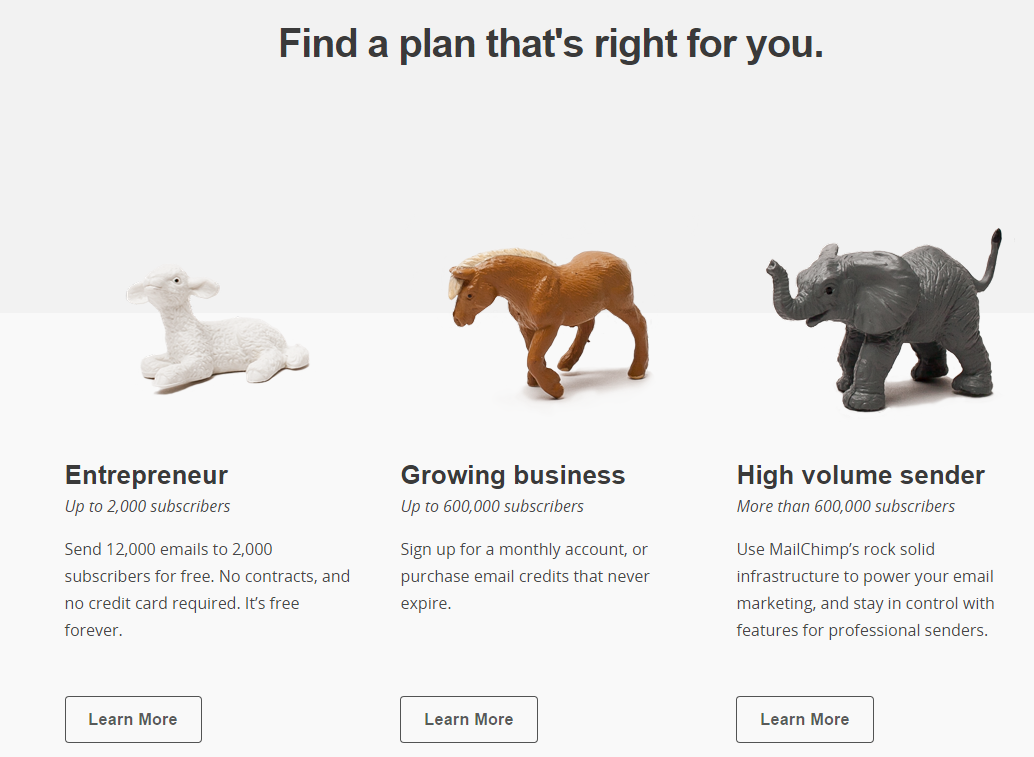
Mailchimp’s 3 service levels are crystal clear with simple Call to Action buttons leading visitors to find the right deal to cover their email marketing needs.
It’s your responsibility to guide your visitors through their buying journey toward a rewarding experience on your website. Get strategic about your navigation paths so you will implement specific and repeated Calls to Action according to your visitors’ expressed or implied interest levels.
Do you need calls to action on your website?

We’re always happy to help you.
Parker Web prides itself on providing a top-notch website experience. Schedule a call today.