
Google bans non-responsive websites from mobile search results.
You expect that people who search Google for your designated key words and phrases have a good chance of finding your content online. Your website users expect you to keep your information current, relevant and valuable to them. They also expect to be able to use your information on the device of their choice. Website User Experience (UX) has a lot to do with fulfilling user expectations.
Web searches on mobile devices are increasing fast (now over 60%) but there are still many robust websites on the Internet that are not optimized to display across all devices and screen sizes. Google announced they will essentially “penalize” such websites because of poor mobile device experiences and lack of responsive functionality. Non-responsive websites are blocked from mobile searches so that users avoid the frustration.
Beyond smartphones, Internet enabled consumer products are here and still more are coming. Household appliances and various items we use every day increasingly feature Internet-ready, interactive display consoles of varying configurations. Designers need foresight to understand how information can be presented and used by every device user. Developers need technical understanding and current tools to program fully mobile-responsive websites.
So the question becomes, what discussions have you and your web team had about remaining visible and relevant through Responsive Design? Are you on a maintenance plan that includes keeping current with the technology curves of search algorithm and Internet Protocol updates?
Designers and developers must apply a new approach to websites, informed by an understanding of mobile information architecture. How will content be laid out and appear on the multitude of different display orientations people use; landscape, portrait, square, big screen TV, phone, tablet, laptop, wearable, appliance…?
The dominant search giant, Google, cares mostly about serving people searching for information on the Internet. Its chief concern is the searcher, whatever device they happen to be searching on.
According to Google, “mobile devices — smartphones in particular — dominate digital media time: 60 percent vs. 40 percent for the PC.” That percentage grows larger by the day. They recently declared that mobile responsive design is a requirement for ranking and classifying websites for search placement. On April 21, 2015, Google launched their new algorithm that critics are calling “Mobilegeddon.”
If your web designer is still designing for the desktop experience, you may be creating a mobile screen mess (or an invisible website) that you’ll need to clean up before Google will even begin to rank it for mobile searches. Search rankings have already dropped for relatively prominent websites that do not display or function well on mobile devices.
Take a look at the two examples below from digital marketing firm Venveo:
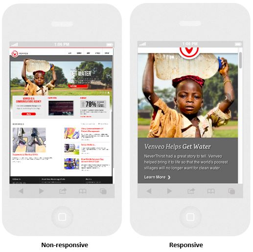
You can see how cumbersome and unreadable most of the non-responsive content is. Just try to interact with it on a small handheld screen. Conversely, the responsive site delivers a clear message immediately with a simple path to navigate and interact with the content.
The good news for many of us is that mobile responsive web design is now considered standard best practice among the majority of reputable web designers. However, since this huge search algorithm update only occurred recently, there are still many prominent, robust websites that have fallen behind the mobile curve and still need to catch up. Don’t let yours be one of them!
Is your website responsive?
Unless you care very little about website traffic and your visitors’ user experience, you need to take this Google update very seriously. Companies are responding in large numbers by upgrading or redesigning their sites to be responsive. Google saw an immediate 5% rise in mobile friendly websites in only one month (May 2015) and that number is growing and at an accelerated rate. Your website needs to be mobile friendly right now or you will lose business to your more nimble and responsive competition!
Take the mobile responsive test now!
If you’re concerned about your website’s mobile search compatibility, here’s what you can do, and Google has made it fast and easy. Find out if your website needs a mobile upgrade by using Google’s simple test. Enter your web page URL into the search field at: https://www.google.com/webmasters/tools/mobile-friendly/.
You’ll be served a clean, simple field to test your web pages as seen below:
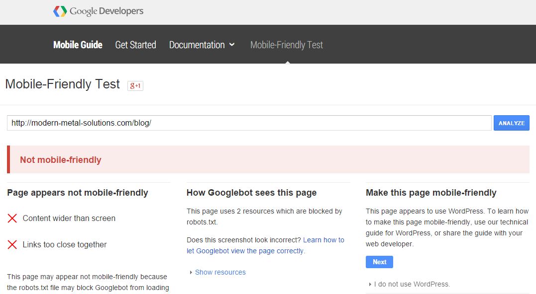
Within seconds you’ll know if the page you entered is mobile friendly or not. By the way, the company in the screen shot example above got their site fixed and it works great on all devices now!
Note: It may be important to test every page on your website including your blog – its index page and the single view article pages. Many websites have been developed by more than one person and oftentimes “band-aid” patches are made for certain page updates which can corrupt the code for proper mobile display.
In the many cases, converting an older website into a mobile friendly one will not require a complete redesign but rather some programming changes. In general, the older the technology used to build the website, the more work that will be required to fix it. Having a mobile friendly site is not an option, it’s a requirement. So what does it take to get your website responsive and mobile friendly?
What to do if your website isn’t responsive:
Should you find out that your website fails the mobile friendly test, chances are it can be fixed relatively quickly. However, every site is different and some may even require a redesign. The first step is really as simple as contacting your web design team and asking what they recommend to make your site responsive. If their response is vague, confusing or elusive in any way, you may need a second opinion.
All respected professional web developers today are attuned to the mobile driven sea change in website development best practices, so it should be easy to find the help you need. If you’re not sure what to do or whom to call, feel free to contact Parker Web Services and we’ll be happy to point you in the right direction.
Cover image source: mymeetingprofessional.com
Parker Web prides itself on providing a top-notch website experience. Schedule a call today.